
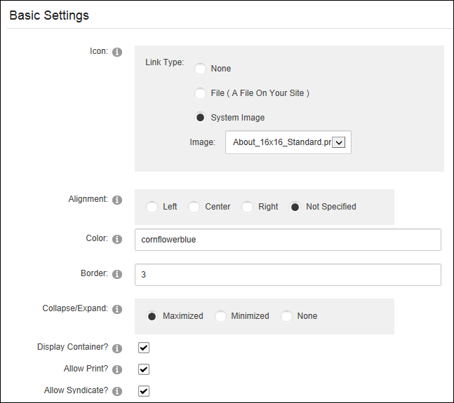
How to set the ModuleDNN uses a modular design system to display content on a page. One or more modules are added to each site page to create and manage the site content. There are many different types of modules, each managing a different type of site content or site administrative tasks. Settings in the PageA page on a DNN site. Settings - Basic Settings section of the ModuleDNN uses a modular design system to display content on a page. One or more modules are added to each site page to create and manage the site content. There are many different types of modules, each managing a different type of site content or site administrative tasks. Settings page. Be aware that the default containers do not include the skin token required to view the icon, Print button or Syndicate buttons however the toggle container does include the Minimize/Maximize option. The Display ContainerA design that can be applied to a module. Containers may include tokens.? field must be marked to display the icon, module title, expand/collapse toggle or the print and syndicate buttons. The below image displays several of the settings that can be configured in this section.
 Manage >
  Settings from the module actions menu.
 the check box to display the module container - OR - unmark
  the check box to hide the module container.
 button is displayed enabling users to minimize the content.
 button is displayed enabling users to maximize the content. the check box to display the module container - OR - unmark the check box to hide the module container including the icon, module title, Minimize/Maximize button, Print button or Syndicate button.
 button which enables users to print the module content. The Print icon displays in the menu and on the module container.
the check box to display the Print button and allow printing. the check box to disable. the check box to display the Syndicate
button which enables users to print the module content. The Print icon displays in the menu and on the module container.
the check box to display the Print button and allow printing. the check box to disable. the check box to display the Syndicate  button which enables users to create an XML syndication of module content - OR - unmark the check box to disable syndication.
the check box to enable WebSliceA Web Slice is a snippet of information (in this case the content of a module) that a user can subscribe to using some Web browsers such as Internet Explorer 8 (IE8). Content within Web Slices are automatically updated by IE8 and can be view directly from the Favorites toolbar. and set any of these optional settings:
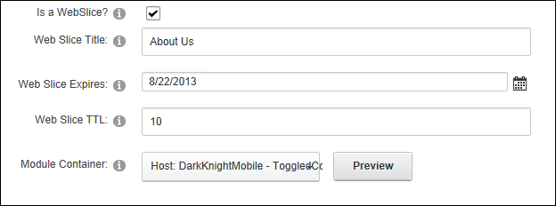
the check box to disable WebSliceA Web Slice is a snippet of information (in this case the content of a module) that a user can subscribe to using some Web browsers such as Internet Explorer 8 (IE8). Content within Web Slices are automatically updated by IE8 and can be view directly from the Favorites toolbar..